How to Turn Deadly Boring Training Materials into Interactive Must-Reads

Published


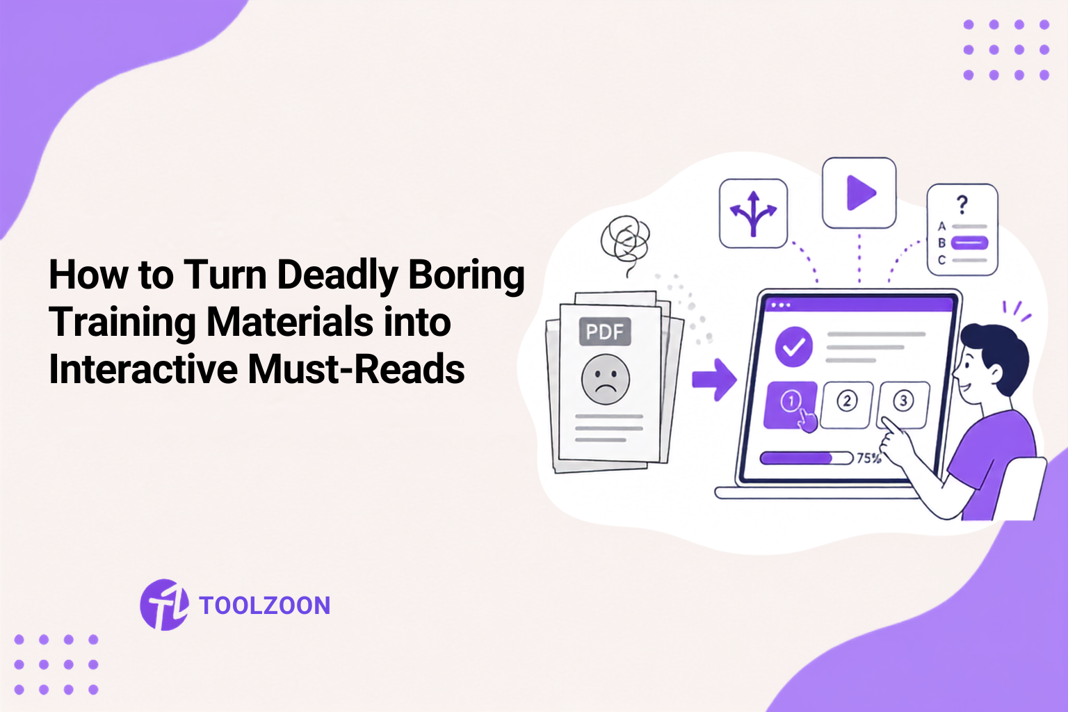
Take any company, and they'll have a training PDF that's been started a thousand times and finished exactly zero. Half-read, forgotten, taking up space in the shared folder, and yet, we all pretend it's the backbone of compliance. Most of such docs have about forty slides of dense text and a quiz at the end no one even gets to.
Brandon Hall did a study back in 2020 and found that less than 16% of companies can actually track their learning metrics properly. Not even basic stuff like who's participating, let alone whether anyone actually learned anything or changed how they work. That's not a content problem exactly. It's a design problem. And it's fixable, though not with more slides or longer videos, which is usually the first instinct.
Why Static PDFs Are Basically Training Graveyards
Think about the last PDF training manual you actually finished from start to finish, without skimming or skipping ahead. Struggling to remember one? That's the point. Static documents ask people to absorb information passively, and human attention just wasn't built for that, not for anything longer than a few minutes anyway.
We've known about the forgetting curve since the 1880s. Ebbinghaus figured out that we lose most of what we learn almost immediately. Within 24 hours, we forget about 70% of new stuff if we don't circle back to it. A static document doesn't reinforce anything. It just delivers a wall of text once and hopes for the best.
Pro Tip: Structure Before You Rewrite Break a dense training PDF into a clear learning outline first. Use Toolzoon's Outline Generator to turn walls of text into short, scannable modules.
What Interactive Actually Means (It's Not Just Adding a Quiz)
Interactivity gets thrown around loosely. Slapping a multiple-choice quiz at the end of a PDF isn't interactivity, not really. It's a formality. Real interactive design changes how information gets processed while someone is reading it, not after.
Turns out, a few things do move the needle:
- Branching scenarios where a wrong answer leads somewhere different than a right one, mimicking real consequences
- Little micro-checks spaced throughout, not one monster quiz at the finish line
- Clickable reveals, little sections you can expand when you're ready
- Interspersing brief video or audio segments throughout to give learners a breather from dense text
None of this requires fancy production values. A well-structured document with logic branches, built inside something like a learning management system, tends to outperform a beautifully designed but static one every time, largely because the platform tracks where people actually drop off, and that data is gold for fixing the weak spots nobody would otherwise notice.
Pro Tip: Build Better Knowledge Checks Turn key policies into short Q&A moments learners can actually use. Try Toolzoon's AI FAQ Generator to create clear micro-checks from your existing training content.
The Psychology Bit Nobody Talks About
When you help create something, you're way more invested in it. There's even a name for it: the IKEA effect. Turns out, people love their cheap bookshelves more because they built them. The same goes for training. If someone just clicks "next" forty times, there's zero ownership. If they make choices, get branched down a path based on those choices, and see the consequences play out, suddenly they're invested. It's not magic, it's just basic behavioral design.
Progress indicators matter too. A visible progress bar, even a rough one, increases completion rates by a meaningful margin, partly because of something psychologists call the "goal gradient effect." People push harder to finish something the closer they get to the end. Leave that bar off, and motivation flatlines somewhere around the halfway mark.
Keep the Content Itself Honest
None of the interactive tricks matter much if the underlying content is bloated. A lot of people make the mistake of writing training like it's a legal contract, trying to cover every possible what-if just in case somebody asks about it later. That's how you take a 10-minute topic and stretch it into a 45-minute punishment.
A better approach, and it sounds almost too simple:
- Cut every sentence that doesn't change what someone will do differently afterward
- Use real scenarios from the actual workplace, not generic hypotheticals
- Test the document on two or three people who weren't involved in writing it, then watch where they get confused or bored
- Break long topics into standalone modules people can finish in one sitting, not a single sprawling file
Turns out, if you keep modules under 15 minutes, way more people actually finish them. Because let's be real, anyone can sneak that in during a coffee break. Block off a full hour? That's never happening.
Pro Tip: Rewrite Dense Training Copy Use Toolzoon's AI Copywriter to tighten legal-sounding passages into clear, conversational language learners will actually finish.
Making It Stick
It's not hard, really. You just have to stop thinking that piling on more content helps people learn. Usually, it just buries them. Ideally, training shouldn't feel like reading a technical manual. It should feel more like having a coworker, maybe a little chatty, but well-meaning, guide you through it one time, keep it clear, and give you a few choices to make as you go.
If rebuilding the entire system feels daunting, begin with a single module. Start with your worst-performing training. Apply two or three of these changes. Track it for three months. You'll be surprised. Theories are great and all, but nothing beats just trying it out and seeing what the numbers actually do.
Ready to rewrite your most boring training docs? Explore Toolzoon's AI Blog Writer and other writing tools to turn dense manuals into clear, engaging learning content in minutes.